Saturday, 16 January 2016

New Measurements - Side Bar

Because I had to change the measurements for my whole front page, it also meant that I would have to change the size of the side bar.
 
After creating to correct sized template, I could now transfer all of my work from the previous sidebar and restart the editing process.
 
Just like The Evening Chronicle has on their sidebars, I have added black rectangle boxes which are fading to grey. As I add the last photo I will start to faded them into the images.

I began to add another photo, my second story.

Thursday, 14 January 2016

New Template

Once I had already made a start on my sidebar and had transferred it over to my final template, I had realised that I had gotten the measurements wrong. In order to ensure that I was going to make my newspaper look as professional as possible, I had to redo the measurements, this included changing the measurements for the side bar too.


Thursday, 10 December 2015

Newspaper Front Cover Progress 5

This is the beginning of the process of adding in my images, this is the first image I have added.

In order to allow my newspaper to follow the conventions of already existing newspapers, I have to use features which are going to stand out and be the most eye catching for the audience. 

Friday, 4 December 2015

Newspaper Front Cover Progress 4

The next step I took was to begin to finish off the full layout of the page. By doing this I have created guidelines for myself to use when creating the rest of the features for my front cover.
At the top of the page I have drawn two lines, the thin line at the top has been used to locate where the title is going to come to an end, and the thicker line below that is marking where the date, price and social media links are going to be located.

Towards the bottom of the page you can see three lines and a set of 5 boxes. The thin line at the top of the 3 lines is used to signal where the bottom of the story or image is going to land, the thicker line is going to have some text situated in the centre giving the company name of the adverts below. The boxes are to symbolise the adverts which are going to be created at a later stage, they have been placed there as guidelines so I know the measurements in advance.

Tuesday, 1 December 2015

Newspaper Front Cover Progress 3

After situating the page numbers onto my front cover I then came to the decision that in order to make it appear as realistic as possible, I should add the red arrows which are located in the bottom left hand corner of the three side story boxes.

Friday, 27 November 2015

Newspaper Front Cover Progress 2 - Font

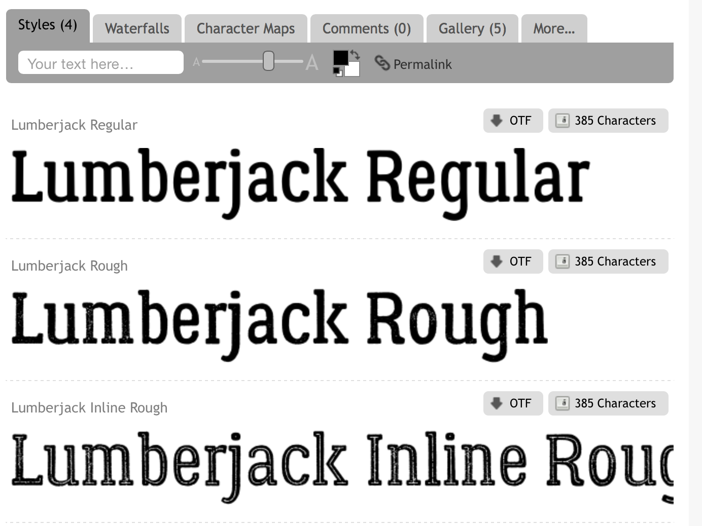
I used 1001 fonts in order to find the perfect font which matched the one used on the Evening Chronicles front covers.
When locating the font I compared the one used on already existing newspapers to ones I could find on the website.
After searching through various amounts of pages of different fonts, I found one called LumberJack.
I then had to decide whether I wanted a clean sharp looking font or a rustic looking font, I then chose to use the Lumberjack Regular font and proceeded to use this on my front cover.