Tuesday, 10 May 2016
Wednesday, 27 April 2016
Tuesday, 26 April 2016
Evaluation Question 4 Part 2
When it came to the construction aspect of my coursework I used the following websites and software:

Indesign
In order to complete my 2nd page, I used InDesign as I felt like this would be the most effective way of creating my work. This software allows you to create even columns the whole way across the page, this helps with the overall layout of the page, it helps to show a clear composition. Because it creates clear columns people can now read my main story with more ease, this also helps to create a more realistic, professional effect to my newspaper overall. By using this software it allowed me to create the second page which was required for my newspaper, it has helped me to provide a well constructed page.

Photoshop
This software is what I have used when creating my front cover and poster, it is a very effective way to create and design pages and you can use the layer feature to strategically place things. When using this software I opened up new layers the whole way through in order to create my page, this allows you to place things where you want them and in whatever order. I used tools such as the Magic Wand tool which allowed me to cut out images with ease to give me a smooth finish. I also used the Line tool, although this is a very simple tool, it allowed me to mark out the measurements of my page, I could easily create guidelines so I would have an idea of where I could place all of my features. When creating my free magazine at the top, the sidebar and advertisement I created them on a separate document then added them onto my overall page once they were fully created and finished. When creating my poster I also used this software, however I used different tools and some extra features such as the Brightness and Contrast to create the perfect effect on my image. I also used the Eraser tool in order to create the rigid effect around each of my headlines, to get the headlines overlapping each other I again strategically placed some of the layers.
Digital Camera
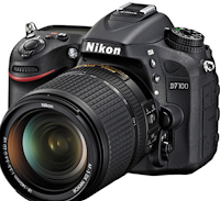
When constructing my newspaper, I needed to take images of certain things in order to make it look as realistic as possible. When it came to my newspaper, after conducing some research I decided I wanted to feature the Tyne Bridge so I went out to Newcastle Upon Tyne to take images. I took 43 images from all different angles and took photos of the back of the bridge too, this would allow me to have a wider range to choose from. When it came to my front cover I had to take photos of more than one thing, I went to Newcastle Crown Court on three separate occasions so I could capture images of my model with different lightings because the weather was different each time we went. This allowed me again to have a wide variety to choose from, I also took them from different distances from the court; outside and across the Tyne. The images used on my advert bar and the first image in my side bar, were all taken in our photo studio, I set up the perfect lighting and took the images to use so they were of high quality.

iPhone
When it came to the images on my sidebar, I used two images which were taken with my iPhone 6. This allowed me to get a more realistic effect for the 'Missing Person' image; this was so it didn't look set up by being HD. The second image I had taken was in Rome, Italy when I visited, and since I didn't have a professional camera with me I just used my iPhone but selected the HDR feature to allow it to seem as professional as possible.

1001fonts
This is a website which provides a lot of different kinds of fonts, this is where 90% of my fonts come from. It is a very efficient way of finding the exact font you are looking for in order to achieve the look you want. I used this when it came to the Title, the headline, the advert bar and the side bar and most text on my 2nd page.

Fodey
This is a website which generates headlines in a certain font, I thought this website was very good when it came to the designing process of my newspaper poster as it allowed me to type in a headline I had created and they provided it in the font for a headline. All I then had to do was use the Snipping Tool to crop the image down to what I needed them went onto Photoshop to finish off the rigid edge effect.

Indesign
In order to complete my 2nd page, I used InDesign as I felt like this would be the most effective way of creating my work. This software allows you to create even columns the whole way across the page, this helps with the overall layout of the page, it helps to show a clear composition. Because it creates clear columns people can now read my main story with more ease, this also helps to create a more realistic, professional effect to my newspaper overall. By using this software it allowed me to create the second page which was required for my newspaper, it has helped me to provide a well constructed page.

Photoshop
This software is what I have used when creating my front cover and poster, it is a very effective way to create and design pages and you can use the layer feature to strategically place things. When using this software I opened up new layers the whole way through in order to create my page, this allows you to place things where you want them and in whatever order. I used tools such as the Magic Wand tool which allowed me to cut out images with ease to give me a smooth finish. I also used the Line tool, although this is a very simple tool, it allowed me to mark out the measurements of my page, I could easily create guidelines so I would have an idea of where I could place all of my features. When creating my free magazine at the top, the sidebar and advertisement I created them on a separate document then added them onto my overall page once they were fully created and finished. When creating my poster I also used this software, however I used different tools and some extra features such as the Brightness and Contrast to create the perfect effect on my image. I also used the Eraser tool in order to create the rigid effect around each of my headlines, to get the headlines overlapping each other I again strategically placed some of the layers.

Digital Camera
When constructing my newspaper, I needed to take images of certain things in order to make it look as realistic as possible. When it came to my newspaper, after conducing some research I decided I wanted to feature the Tyne Bridge so I went out to Newcastle Upon Tyne to take images. I took 43 images from all different angles and took photos of the back of the bridge too, this would allow me to have a wider range to choose from. When it came to my front cover I had to take photos of more than one thing, I went to Newcastle Crown Court on three separate occasions so I could capture images of my model with different lightings because the weather was different each time we went. This allowed me again to have a wide variety to choose from, I also took them from different distances from the court; outside and across the Tyne. The images used on my advert bar and the first image in my side bar, were all taken in our photo studio, I set up the perfect lighting and took the images to use so they were of high quality.

iPhone
When it came to the images on my sidebar, I used two images which were taken with my iPhone 6. This allowed me to get a more realistic effect for the 'Missing Person' image; this was so it didn't look set up by being HD. The second image I had taken was in Rome, Italy when I visited, and since I didn't have a professional camera with me I just used my iPhone but selected the HDR feature to allow it to seem as professional as possible.

1001fonts
This is a website which provides a lot of different kinds of fonts, this is where 90% of my fonts come from. It is a very efficient way of finding the exact font you are looking for in order to achieve the look you want. I used this when it came to the Title, the headline, the advert bar and the side bar and most text on my 2nd page.

Fodey
This is a website which generates headlines in a certain font, I thought this website was very good when it came to the designing process of my newspaper poster as it allowed me to type in a headline I had created and they provided it in the font for a headline. All I then had to do was use the Snipping Tool to crop the image down to what I needed them went onto Photoshop to finish off the rigid edge effect.
Monday, 25 April 2016
Thursday, 21 April 2016
Evaluation Question 3 - Part 2
Newspaper Page 1 Questionnaire:
I produced a questionnaire to allow me to explore my potential target audience, by creating this questionnaire it will give me an understanding and some knowledge regarding who reads newspaper, their age and gender, along with what the like to see featured within tabloid newspapers. I handed out this newspaper to 20 people as well as creating an identical one on Survey Monkey to which 6 people responded on, all together I then had 26 responses regarding the audience’s needs of my newspaper; this would guide me to producing the most popular newspaper I could create using Adobe Photoshop and InDesign. I only included 6 questions on this questionnaire as well as I felt like I had provided enough questions to gain all of the information needed, I covered questions such as the gender, age and interests so I could tailor my content accordingly. I asked how often people read newspapers which will allow me to know whether to feature content just covering daily stories or featuring content from throughout the whole week, which would allow a more detailed newspaper to be produced. I asked the question “What do you enjoy reading? by asking this question I am allowing those answering the questionnaire to tell me exactly what they would like to see featured within my newspaper, widening my target audience and including more content. The option which received the most votes was crime, this option received 14 votes which was shortly followed by the category gossip which received 10 votes. This determined what my main story would be along with the stories featured on my side bar. I also added the question asking where people would like to see my stories covering, since I handed this out to 20 people and 17 responses came back with the answer town centres and the other 3 were local, I will be basing my main story on someone who lives locally within Gateshead although the story will be based in Newcastle Upon Tyne.
Wednesday, 20 April 2016
Evaluation Question 2 Part 4
I would have a website that would be the hub for your promotional campaign and you could access the online version, take part in competitions as well as be able access the links at to the paper's social network sites. Social networking sites are an extremely important feature to have on newspapers so this is why I have included them on my main product. A heavy online presence is needed as we are living in a world of the digital age, social media plays a very big role within today’s society, especially with those of the younger generation; my target audience. By providing those reading with a link to a website, I am allowing the readers to have access to exclusive information such as more information about featured stories, more competitions, and more adverts. I will also be providing people with social media links, for example those with twitter can follow the official Daily Tyne twitter page and can see live updates to new stories. For those who use Facebook we can share stories on our official page, this will allow people to have easy access to stories without even having to look for them, this can also be a place where readers can sit and converse about their thoughts and opinions. I could provide people with a link to an Instagram account; this could be where competitions and adverts are featured.
Evaluation Question 2 - Part 2
How effective is the combination of your main product and ancillary texts?
The poster which I have created for my ancillary task has provided my work with an extremely local angle, the headlines which I made individually and situated onto the page are all regarding local issues such as: “Monument Madness” “Bigg Market Battering” since these are areas of Newcastle, it gives my newspaper a local aspect. My main image used on my poster is also a very iconographic image of Newcastle so everyone will recognise where the paper features.
The location of my ancillary tasks is fairly important. My poster will play a big role in the popularity of my newspaper; I would have my poster be displayed outside newsagents as well as inside of their shop windows followed my corner shop windows too. This will mean those walking past will see my newspaper being advertised allowing it to become more recognisable, as people will know that my poster is obviously linked in with my newspaper. I would like to hear my radio advert being played on radio stations such as Metro Radio, this is a very local radio station which is only broadcasted within the North East, because this is a local radio station it links it much better with the advertisement of my newspaper because those listening will be able to find my main product in their local stores.
Evaluation Question 1 - Part 3
I will be annotating a front page and another page from a local tabloid newspaper, I will be linking this in with Galtung and Ruge's theory.
Frequency
The first section of Galtung and Ruge's theory is frequency.
This is a screen shot of the dateline which is featured near the top of the page,
this will show us when the newspaper was printed to see if the story featured is still relevant, this will help with the impact that they story will have on the audience.
Threshold
This event is big enough to make it onto local news, this maybe could be placed into national news because it is regarding football which is very big thing, but does not target a large majority of people only football fans. This story would be big enough to cause a discussion with those who are interested or support Newcastle United Football Club.
Unambiguity
The event featured is quite clear, the use of a big bold headline will help to allow the reader to gain an idea of what the story may be about, the use of a strap line will also help to inform the audience. This is used as a way of giving away some information regarding the story, but not too much to give it away.
Meaningfulness
The event will appear fairly meaningful to the reader, this is because the Evening Chronicle is known popularly for their sports stories. It includes a large amount of content regarding sporting actives which are going on within Newcastle, as well as across the country; but not as much.
Consonance
The event will match the audience's expectations, this is because the story is featuring the views from them. The story is regarding how the fans of Newcastle United are enraged with Mike Ashley. This has been done to keep the audience sweet, by taking their side.
Unexpectedness
Although this main story is not unexpected, due to the audience more than likely already knowing that there is some anger flying around regarding football. I don't feel like this section of the theory links in overly well with Galtung and Ruge's theory.
Continuity
Because this story is regarding football, it can be continuously covered due to the different stages and leagues which come with football. The Evening Chronicle can cover football stories for as long as the season is going, this is one of their main features. Because their main story is regarding the manager of the club, the newspaper can keep covering content regarding his side of the story or the actions he takes next.
Negativity
Bad news is good news in terms of newspapers, because this is a negative story it will attract more readers especially fans of the football club they are covering content on. This will push more people to buy the newspaper so they can find out what is happening with the club they support.
Reference to elite nations/celebrities
This newspaper falls under both categories linked together. As the newspaper is covering the local football team, this football club will receive more coverage than what football teams throughout the country would, this is because they want to target the audience which live around Newcastle as this is where a large majority of the fans live. The football players and manager will also be seen as being celebrities, and since they are associated with Newcastle United Football Club, this suggests that they are important if they have a story featuring them.
Tuesday, 19 April 2016
Friday, 8 April 2016
Monday, 4 April 2016
Friday, 1 April 2016
Thursday, 31 March 2016
Radio Advert Draft Evaluation Question 3 Part 4
After receiving feedback for my radio advert, my target audience suggested that it was not quite finished yet. Although I felt like this was my completed advert, I am going to listen to the feedback I received and will add more to my piece.
Monday, 28 March 2016
Front Cover Progress 12
Once I had carefully selected the font for my newspaper, after help via survey, I then decided to situate it on this position on my page. I feel like it gives off a very professional effect to my newspaper.
I then added my free magazine in the top right hand corner on my newspaper, after conducting my research I came to discover that this is a very stereotypical convention of a newspaper. It is used as a way of drawing the reader in as it is exclusively free to those purchasing the newspaper.
Thursday, 24 March 2016
Wednesday, 23 March 2016
Asda Side Story Text - Second Page
Asda in Felling ar esupporting the company’s Neighbourhood Food Collection, which is being staged in conjucntion with Trussell Trust and Fareshare.
There will be food collection points near the front of the front of the store from Thursday to Sunday.
There will be volutneers on hand to help with any issues.
An Asda spokesperson said: "If you just pop along to one of our stores, as we have this running in our Gosforth braches also, and donate an item of long-life food. We will thhen work with our two charity partners.
Comments and Complaints Text - Second Page
If throughout our newspaper we have published anything is factually inaccurate, please feel free to contact our editor, Abbie Little on 0191 284 3864, via email at abbielittle.dt@helmsleymedia.
The Daily Tyne is published by Helmsley Media, which is a member of IPSO which is the Independent Press Standards Organisation. We adhere to the Editor’s Code of Practice as enforced by IPSO; this is where you should make formal complaints by contacting dtadvice@ipso.co.uk or via telephone on 0300 123 2220. Please go to www.dailytyne.com/complain where you can view our Complaints Policy and Procedure. A "How To Complain" pack is available by writing to the Legal and Compliance Department, Helmsley Media, 166 Helmsley Rd, Newcaslte Upon Tyne, NE2 1RD
Main Story
Courtney Choppen leaving court with a hefty £1,304 court bill after swiping treasured belongings from her family.
A student who stole thousands of pounds’ worth of jewellery and electronic devices from her family before setting herself in a web of lies to cover her crime, has been given her sentence and will be spending her 18th birthday in jail.
Courtney Choppen told betrayed family members at their home in Bill Quay that she had no clue where their possessions had gone. Hiding them in the boot of her car - which was recently registered as being stolen - had been spotted out wearing pieces of the stolen jewellery, as she assumingly spent the looted money.
In order to bide her tracks, the 17-year-old had changed her stories on several occasions, insisting she was oblivious to the whereabouts of the missing items. Claiming she hadn’t been within close range of the alleged ‘misplaced things’, shortly followed by the declaration that she in fact was not aware that her family owned the lost articles.
Arrested by police, Choppen continuously denied the theft until admitting her guilt on the day of her trial at Newcastle Crown Court. Given an 18 month prison term - followed by a restraining order against the house for 12 months - the student was found guilty of the theft of the belongings and money.
The court heard that Choppen had started to take various items from the house as early as the age of 13, on Nov-ember 5 last year she was caught having just gotten hold of her siblings technology devices - swiped from her bedroom. Although she was caught in the act, Choppen still managed to get away scotch free for a further 2 months – allowing more items to be stolen.
Bethany Frizzel, prosecuting, said: "On November 29 your car was spotted outside of your mother’s home despite you providing an alibi. Neighbours can con firm that you were on the premises at the time when your family were away on a short break.
This appeared to you as a prime time to go on the hunt again, retrieving even more items for your family home – betraying them once again. You provided false evidence which stated you were on your college at the time, providing you actually attended college – we would find this more believable."
Choppen, of Kinross Ct, Gateshead, was unrepresented at court and offered no mitigation to magistrates ahead of sentencing. As well as being given an 18 month prison sentence without bail, she was ordered to pay £790 in prosecution costs as well as an £514 victim surcharge – making for a total court bill of £1,304.
Monday, 21 March 2016
Daily Tyne Contact Column 2 - Second Page
Published by Helmsley Media, 166 Helmsley Rd, Newcaslte Upon Tyne, NE2 7XT
Tel: 0191 501 5800
Registered as a newspaper at the Post Office. All advertisemnts with the Daily Tyne are publishers’ copyright and many not be reproduced in any form wihtout written permission.
Jobs: jobs.dailytyne@helmsleymedia.
Public Notices: publicnotices@helmsely.co.uk
Private Class Ads@helmsley.co.uk
Announcements: dtu@helmsley.co.uk or call 0204 0547 875
For local trades & services, jobs, private sales - including property and cars - or family announcements call 0191 503 8766
Jobs: jobs.dailytyne@helmsleymedia.
Public Notices: publicnotices@helmsely.co.uk
Private Class Ads@helmsley.co.uk
Announcements: dtu@helmsley.co.uk or call 0204 0547 875
For local trades & services, jobs, private sales - including property and cars - or family announcements call 0191 503 8766
What's On Text - Second Page
After attracting plenty of visitors throughout the Easter Holidays, Beamish Woods in Stanley, have organised the North East Puddle Jumping Championship. This will take place next weekend, May 28th; this is something which is open to those of all ages. Throughout the woods, visitors will have the chance to participate in the Championship as well as take part in a few little activities such as a Lego brick animal trail, which will feature giant animal sculptures.
There will be a small fee for attending the trail.
Daily Tyne Contact Column 1 - Second Page
Editor: Abbie Little
0191 284 3864
General Enquiries: 0191 224 4740
Newsdesk: 0191 201 6478
Picturedesk: 0191 201 8263
Sportsdesk: 0191 201 4746
Home delivery: 0800 637 2826
Advertising Manager Field Sales: 0191 201 3956
Photosales: 0191 201 6275
Daily Tyne, Helmsley Rd, Newcastle upon Tyne, NE2 1RD
Editorial: 0191 201 4563
Advertising: 0191 208 8957
Price: 60p
Friday, 18 March 2016
2nd Page - Style Model
This is what I have been using as a style model for my second page, this is where I have been gaining ideas from in order to produce a professional looking second page

Thursday, 17 March 2016
Front Cover Progress 11
The next step to my front cover was adding my title, I also chose to change the colour of the text in order to follow my colour scheme which was a burgundy colour.
As I will be adding an image towards to right hand corner of the page, I will need to slightly adjust the positioning of my title.
Wednesday, 16 March 2016
Questionnaire Results
These are the results I was left with once I had conducted my questionnaire and handed it out, this allowed me to see that people preferred the Domine Bold font.
Second Page Progress 1
These are first steps I have taken into beginning to design my 2nd page for my newspaper. Just like my style model which is the Evening Chronicle, I have situated a red bar across the full length of the page. This has allowed me to separate the top section which features things such as the newspaper's website, the page number, date and newspaper name.
Tuesday, 15 March 2016
Newspaper Name Questionnaire
1. When looking for a newspaper, what type of title do you look?
Simplistic Vibrant Black and White Colourful Handwriting Bold
2. Do you prefer to see more colourful newspaper titles, if yes why?
Yes No
_________________________________________________________________________
3. Out of these 4 fonts which do you prefer?

Tulia
 Domine
 Nimbus Roman No9
 Libri Bodoni
Simplistic Vibrant Black and White Colourful Handwriting Bold
2. Do you prefer to see more colourful newspaper titles, if yes why?
Yes No
_________________________________________________________________________
3. Out of these 4 fonts which do you prefer?
Tulia
 Domine
 Nimbus Roman No9
 Libri Bodoni
Monday, 14 March 2016
Newpaper Names Progress
Since picking fonts and spending a lot of time looking at the name, I have decided that I am going to be changing my newspaper's name to Daily Tyne. I feel like this is a more suitable name for a newspaper and I would prefer to call it this, it stands out more than Tyne News did and does not sound as monotone as before. I also think that it will appear better on the page and add a more appealing composition to the page.
By narrowing down my options, I can now decide which font I definitely want to use. That is going to be the Domine font in bold.
Friday, 11 March 2016
Tuesday, 8 March 2016
Top Corner Idea
In order to fill the blank space which will be on my page near the title, I am going to fill that with a free magazine. Usually you would find fashion magazines inside of newspapers, but since I have not placed any sport stories on my front page, I should fill that space with a sports magazine; this is because most newspapers cover sport activity.
Monday, 7 March 2016
Front Cover Progress 10
https://docs.google.com/presentation/d/1gcVcvghSaT_oavRa5aPs-sYZw8-231BSjVU2p0Q9SQY/edit?usp=sharing
Tuesday, 1 March 2016
Radio Advert Progress - Script
So those who I am using for my advert know what to say, I have come up with a script that I would like them to follow.
As the advert only has to be 30 seconds long my script won't be long, just a few lines.
As the advert only has to be 30 seconds long my script won't be long, just a few lines.
In Newcastle and not aware of what’s going on around you?
Don’t worry we have that covered, just pick yourself up a
copy of Daily Tyne and you’ll be sorted.
All you need in one place. Gossip:
Celebrity drug scandal, Sports “WHEEEEEEEEY GOAL”
All yours for just 60p!
Best newspaper in the north east
voted by the locals. Isn’t that right?
“A love getting my copy of Daily
Tyne on a Tuesday”
“Ah aye definitely favourite
newspaper around”
I will have different people saying different parts, this will allow the radio advert to sound more diverse; it wont sound monotone being the same voice the whole way through.
Monday, 29 February 2016
Front Cover Progress - Participants
For my main story I will be using Courtney Choppen who will be known as herself.
For my business story on my sider I will be using Harley Wall who will be known as himself.
For my lost student story I will be using Luke Roberts who will be known as himself.
For my business story on my sider I will be using Harley Wall who will be known as himself.
For my lost student story I will be using Luke Roberts who will be known as himself.
Title - Fonts
After creating a questionnaire I decided to go with the name Tyne News, because I had now chose the name I could move onto the next step which would be picking the font.
When picking the font I wanted something which was bold, so when I changed the colour of the text it would still stand out against the background. I also wanted something which would follow with the usual conventions of a newspaper title font, this means it will have to look like slight handwriting.

Sunday, 28 February 2016
Radio Advert Progress 2 - Song Choice
Saturday, 27 February 2016
Radio Advert Progress 1 - Research
In order to create a radio advert for my newspaper I had to research and look into already existing radio adverts for newspapers, this would allow me to gain an idea of what I should include in my advert to ensure that I was creating something which people would pay attention to.
Although I could not find any official newspaper radio adverts on Youtube, I did come across some radio adverts for other products. When doing so, I discovered that nearly all had background music; this is to draw attention to your advert. My first step will be to pick a song to use as background music.
Although I could not find any official newspaper radio adverts on Youtube, I did come across some radio adverts for other products. When doing so, I discovered that nearly all had background music; this is to draw attention to your advert. My first step will be to pick a song to use as background music.
Front Cover Progress - Title
I will be changing the colour of my title based upon my colour scheme
after researching what colours are more attractive to those of a younger age I will be using the colour burgundy. I have also chosen this colour as I feel like the stereotypical colours for newspapers are blue and red, I want my newspaper to stand out more.
after researching what colours are more attractive to those of a younger age I will be using the colour burgundy. I have also chosen this colour as I feel like the stereotypical colours for newspapers are blue and red, I want my newspaper to stand out more.
Thursday, 25 February 2016
Front Cover Progress 8
When creating the dateline I noticed that I had used the incorrect font and did not think that it looked right on the page, this is when I went on to change the font to a new one which I also found of 1001fonts.com
I chose Saturday 21st May in particular because after research I discovered that Saturdays were the most beneficial day to sell newspapers on, this is near the end of the week so you can cover stories briefly from throughout the whole week, can also discuss football matches and other sporting activities which will be occurring that day or the following as weekend newspapers are well known for their sporting sections.
I chose Saturday 21st May in particular because after research I discovered that Saturdays were the most beneficial day to sell newspapers on, this is near the end of the week so you can cover stories briefly from throughout the whole week, can also discuss football matches and other sporting activities which will be occurring that day or the following as weekend newspapers are well known for their sporting sections.
Front Cover Progress 7
Once I had selected the photo I wanted to use I had to ensure that everything was perfect and that it was looking exactly the way I wanted it to, to achieve this I opened up the image on Adobe Photoshop
I then began to crop it to the correct size, I did not want the people to be in the background.
and enhance the brightness and contrast on the image to ensure that it doesn't look out of proportion.
I then began to crop it to the correct size, I did not want the people to be in the background.
and enhance the brightness and contrast on the image to ensure that it doesn't look out of proportion.
Wednesday, 24 February 2016
Front Cover Progress 6
I took photos of the model for my front cover in front of Newcastle Crown Court in order to link my main image on the front cover with the story on the second page. Allowing the photos to be taken in that location will make the newspaper more appear more realistic
I felt like this angle would have been better for the second page, so I will not be using this image.
I felt like this image looked too staged, this is something which I did not want to happen, so I will not be using this image.
I think this will be the image which I use this image, I really like the way that Courtney is the main focus but you can also see her location easily.
This was another image I took, I liked the way this one was set out, but due to not being able to see my models face much I chose not to use it.
Monday, 22 February 2016
Newspaper Names
As all newspapers need to have a name, preferably linking to the area where they will be covering stories, so I have came up with a few ideas such as:
Tyne Meridonal
Daily Tyne
NE Observer
Tyne News
(Add more)
The next step once choosing my newspaper name will be to choose a font from 1001fonts.com
Tyne Meridonal
Daily Tyne
NE Observer
Tyne News
(Add more)
The next step once choosing my newspaper name will be to choose a font from 1001fonts.com
Friday, 19 February 2016
Saturday, 13 February 2016
Front Page Progress 5
I have now selected a font to use for my dateline which is called Caslon OS, this font is slightly similar to the one which is used on the Evening Chronicle which I am using as my style model.
After creating a questionnaire and researching how much I should charge for my newspaper, I came to the conclusion that I should charge my target audience and the general public 60p.
I have also now removed the competition section of my newspaper, I felt like it would not fit within the layout of the front cover; I have also already featured a competition within the sidebar.
Friday, 12 February 2016
Front Page Progress 4
I then decided to do this for the rest of my front cover, the blocks across the top are where my title and competition are going to be located. I have placed thin lines across the top and above where my adverts are going to be, these will be staying on my final front cover as these are on my style model too. Because I now have all the measurements and guidelines I can now begin to add my final pieces together.
Sunday, 7 February 2016
Front Page Progress 3
So I can have a clearer idea of the size my advert needs to be, I have created a solid block so I can get the exact measurements for when I add it onto the front cover. This will allow me to get a better idea of where I need to situate other things, I can also see whether I have left enough space around my features because as seen on my style model, there is a border around the whole newspaper. And if I want mine to look as similar to my style model as possible I will have to replicate this.
Thursday, 4 February 2016
Front Page Progress 2
I have now began to put on the measurements and guidelines for where I am going to be placing pictures, texts, adverts and my title onto my front cover.
Thursday, 28 January 2016
Front Page Progress
This is my sidebar which I have placed onto my final front page template, I have measured up where I should place this against my style model, which is The Chronicle.
Wednesday, 27 January 2016
Sidebar Progress 3
This is now my nearly complete sidebar, all I have left to do is to now resize the font to make it look a bit neater.
Thursday, 21 January 2016
Sidebar Text 2
I then added more font onto my sidebar, I am still using the font Tahoma.
This is going to be the text that am I going to use throughout most of my newspaper.
Subscribe to:
Comments (Atom)


