Courteney Media
Tuesday, 10 May 2016
Wednesday, 27 April 2016
Tuesday, 26 April 2016
Evaluation Question 4 Part 2
When it came to the construction aspect of my coursework I used the following websites and software:
Indesign
In order to complete my 2nd page, I used InDesign as I felt like this would be the most effective way of creating my work. This software allows you to create even columns the whole way across the page, this helps with the overall layout of the page, it helps to show a clear composition. Because it creates clear columns people can now read my main story with more ease, this also helps to create a more realistic, professional effect to my newspaper overall. By using this software it allowed me to create the second page which was required for my newspaper, it has helped me to provide a well constructed page.
Photoshop
This software is what I have used when creating my front cover and poster, it is a very effective way to create and design pages and you can use the layer feature to strategically place things. When using this software I opened up new layers the whole way through in order to create my page, this allows you to place things where you want them and in whatever order. I used tools such as the Magic Wand tool which allowed me to cut out images with ease to give me a smooth finish. I also used the Line tool, although this is a very simple tool, it allowed me to mark out the measurements of my page, I could easily create guidelines so I would have an idea of where I could place all of my features. When creating my free magazine at the top, the sidebar and advertisement I created them on a separate document then added them onto my overall page once they were fully created and finished. When creating my poster I also used this software, however I used different tools and some extra features such as the Brightness and Contrast to create the perfect effect on my image. I also used the Eraser tool in order to create the rigid effect around each of my headlines, to get the headlines overlapping each other I again strategically placed some of the layers.
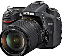
Digital Camera
When constructing my newspaper, I needed to take images of certain things in order to make it look as realistic as possible. When it came to my newspaper, after conducing some research I decided I wanted to feature the Tyne Bridge so I went out to Newcastle Upon Tyne to take images. I took 43 images from all different angles and took photos of the back of the bridge too, this would allow me to have a wider range to choose from. When it came to my front cover I had to take photos of more than one thing, I went to Newcastle Crown Court on three separate occasions so I could capture images of my model with different lightings because the weather was different each time we went. This allowed me again to have a wide variety to choose from, I also took them from different distances from the court; outside and across the Tyne. The images used on my advert bar and the first image in my side bar, were all taken in our photo studio, I set up the perfect lighting and took the images to use so they were of high quality.
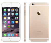
iPhone
When it came to the images on my sidebar, I used two images which were taken with my iPhone 6. This allowed me to get a more realistic effect for the 'Missing Person' image; this was so it didn't look set up by being HD. The second image I had taken was in Rome, Italy when I visited, and since I didn't have a professional camera with me I just used my iPhone but selected the HDR feature to allow it to seem as professional as possible.

1001fonts
This is a website which provides a lot of different kinds of fonts, this is where 90% of my fonts come from. It is a very efficient way of finding the exact font you are looking for in order to achieve the look you want. I used this when it came to the Title, the headline, the advert bar and the side bar and most text on my 2nd page.

Fodey
This is a website which generates headlines in a certain font, I thought this website was very good when it came to the designing process of my newspaper poster as it allowed me to type in a headline I had created and they provided it in the font for a headline. All I then had to do was use the Snipping Tool to crop the image down to what I needed them went onto Photoshop to finish off the rigid edge effect.

Indesign
In order to complete my 2nd page, I used InDesign as I felt like this would be the most effective way of creating my work. This software allows you to create even columns the whole way across the page, this helps with the overall layout of the page, it helps to show a clear composition. Because it creates clear columns people can now read my main story with more ease, this also helps to create a more realistic, professional effect to my newspaper overall. By using this software it allowed me to create the second page which was required for my newspaper, it has helped me to provide a well constructed page.

Photoshop
This software is what I have used when creating my front cover and poster, it is a very effective way to create and design pages and you can use the layer feature to strategically place things. When using this software I opened up new layers the whole way through in order to create my page, this allows you to place things where you want them and in whatever order. I used tools such as the Magic Wand tool which allowed me to cut out images with ease to give me a smooth finish. I also used the Line tool, although this is a very simple tool, it allowed me to mark out the measurements of my page, I could easily create guidelines so I would have an idea of where I could place all of my features. When creating my free magazine at the top, the sidebar and advertisement I created them on a separate document then added them onto my overall page once they were fully created and finished. When creating my poster I also used this software, however I used different tools and some extra features such as the Brightness and Contrast to create the perfect effect on my image. I also used the Eraser tool in order to create the rigid effect around each of my headlines, to get the headlines overlapping each other I again strategically placed some of the layers.

Digital Camera
When constructing my newspaper, I needed to take images of certain things in order to make it look as realistic as possible. When it came to my newspaper, after conducing some research I decided I wanted to feature the Tyne Bridge so I went out to Newcastle Upon Tyne to take images. I took 43 images from all different angles and took photos of the back of the bridge too, this would allow me to have a wider range to choose from. When it came to my front cover I had to take photos of more than one thing, I went to Newcastle Crown Court on three separate occasions so I could capture images of my model with different lightings because the weather was different each time we went. This allowed me again to have a wide variety to choose from, I also took them from different distances from the court; outside and across the Tyne. The images used on my advert bar and the first image in my side bar, were all taken in our photo studio, I set up the perfect lighting and took the images to use so they were of high quality.

iPhone
When it came to the images on my sidebar, I used two images which were taken with my iPhone 6. This allowed me to get a more realistic effect for the 'Missing Person' image; this was so it didn't look set up by being HD. The second image I had taken was in Rome, Italy when I visited, and since I didn't have a professional camera with me I just used my iPhone but selected the HDR feature to allow it to seem as professional as possible.

1001fonts
This is a website which provides a lot of different kinds of fonts, this is where 90% of my fonts come from. It is a very efficient way of finding the exact font you are looking for in order to achieve the look you want. I used this when it came to the Title, the headline, the advert bar and the side bar and most text on my 2nd page.

Fodey
This is a website which generates headlines in a certain font, I thought this website was very good when it came to the designing process of my newspaper poster as it allowed me to type in a headline I had created and they provided it in the font for a headline. All I then had to do was use the Snipping Tool to crop the image down to what I needed them went onto Photoshop to finish off the rigid edge effect.
Monday, 25 April 2016
Subscribe to:
Comments (Atom)


